

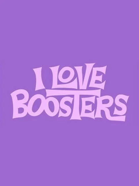
The Font Behind I Love Boosters: Why Typography Matters More Than You Think
Director Boots Riley and artist J. Otto Seibold make the perfect team. Seibold’s playful, retro lettering gives I Love Boosters its cartoon-cool charm, while Riley uses that optimism and silliness to contrast with the film’s deeper themes. It’s proof that a great font doesn’t just look good—it helps tell the story.